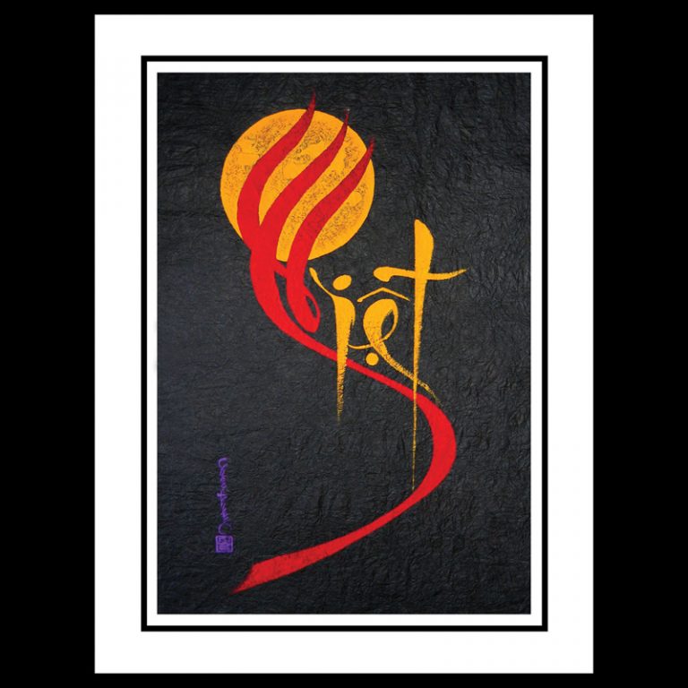
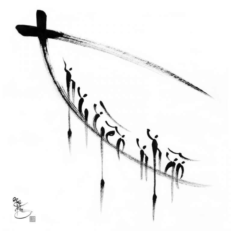
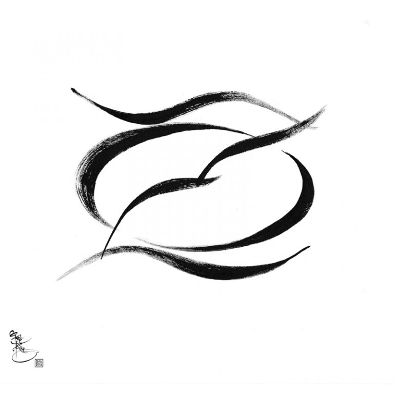
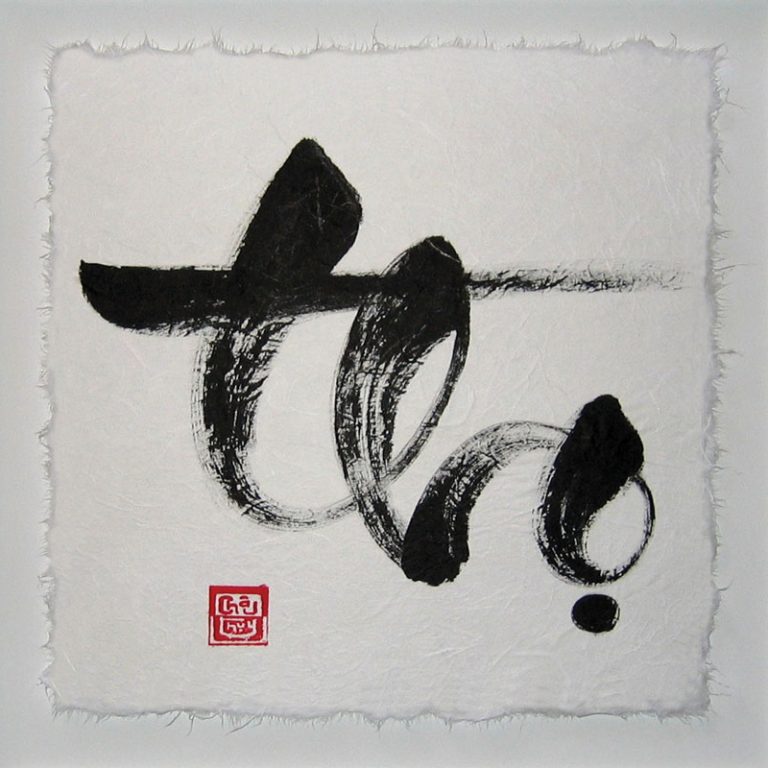
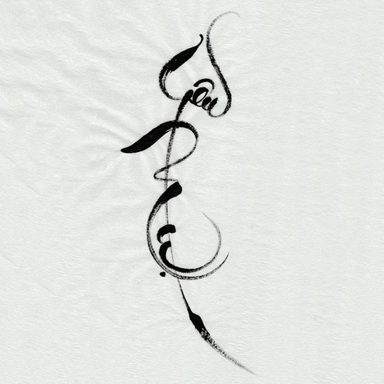
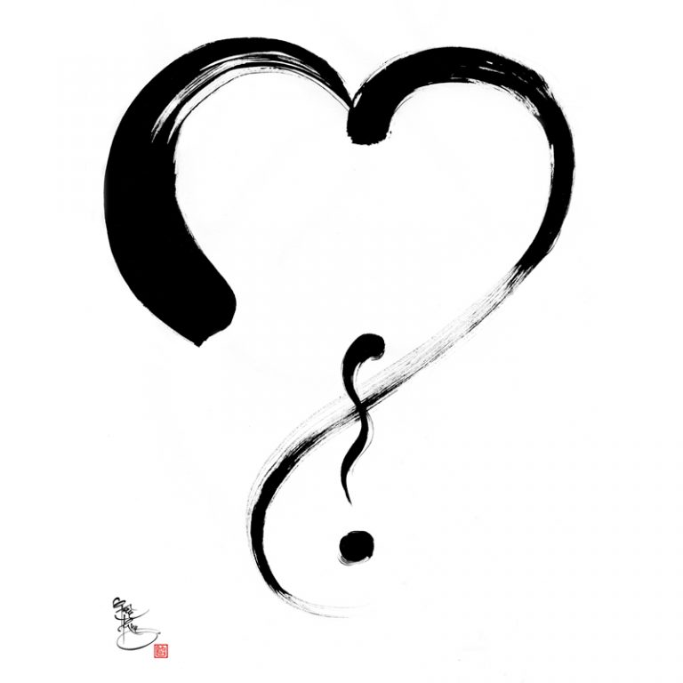
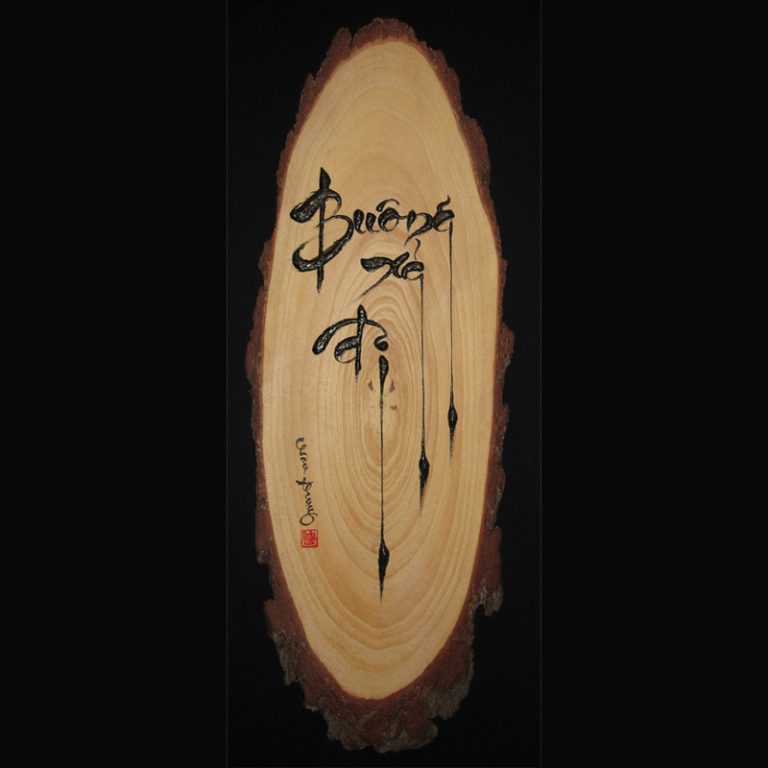
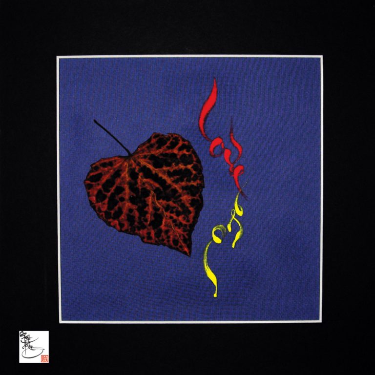
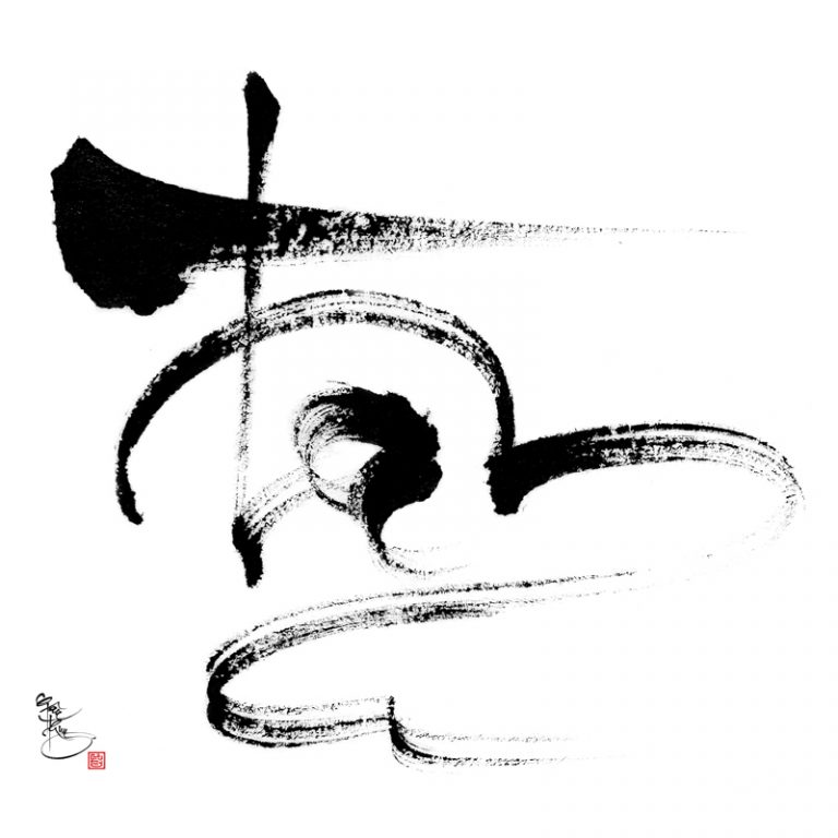
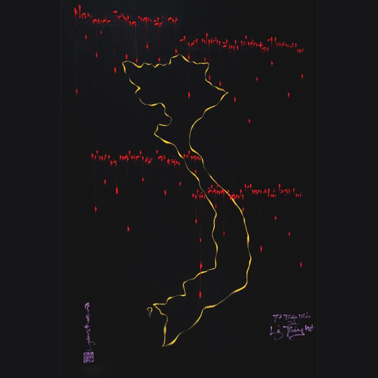
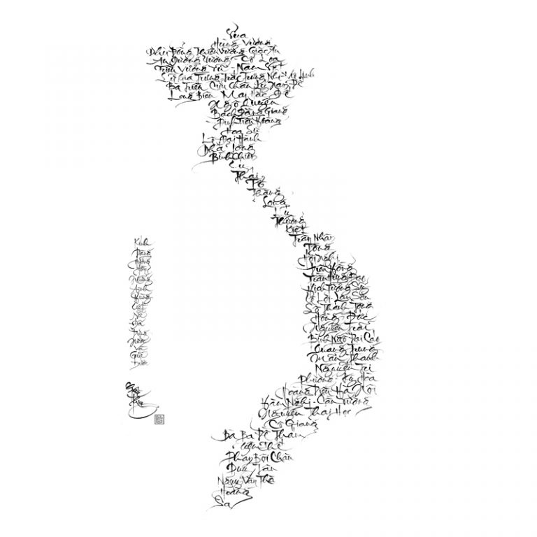
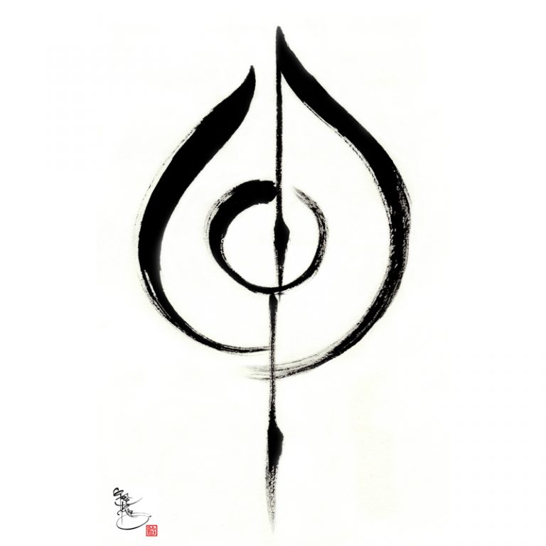
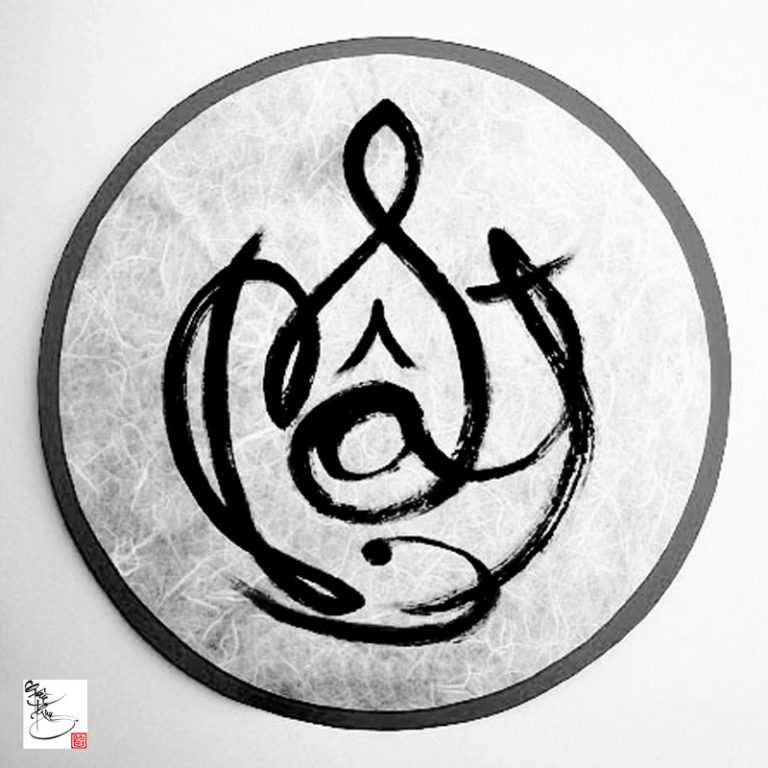
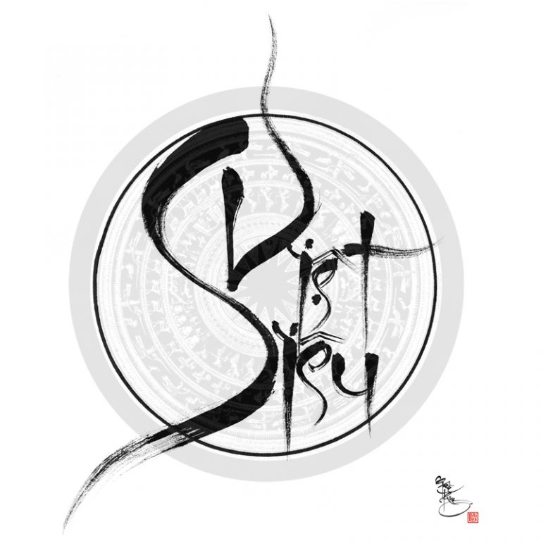
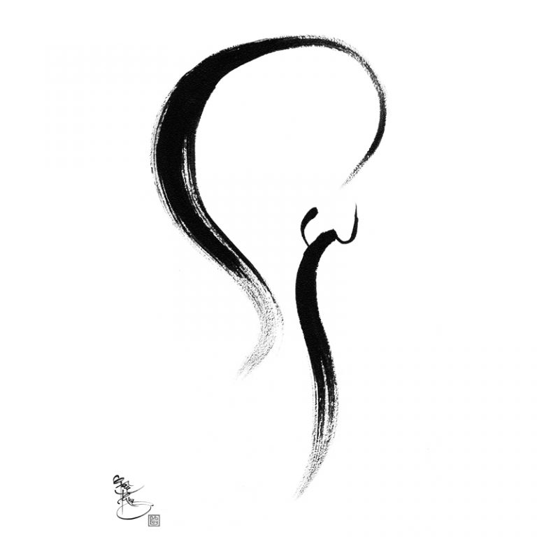
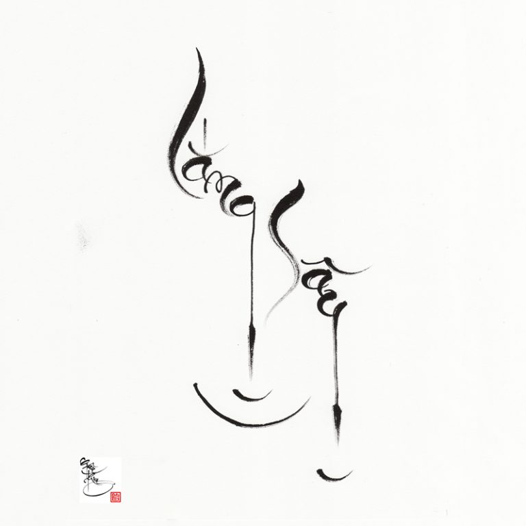
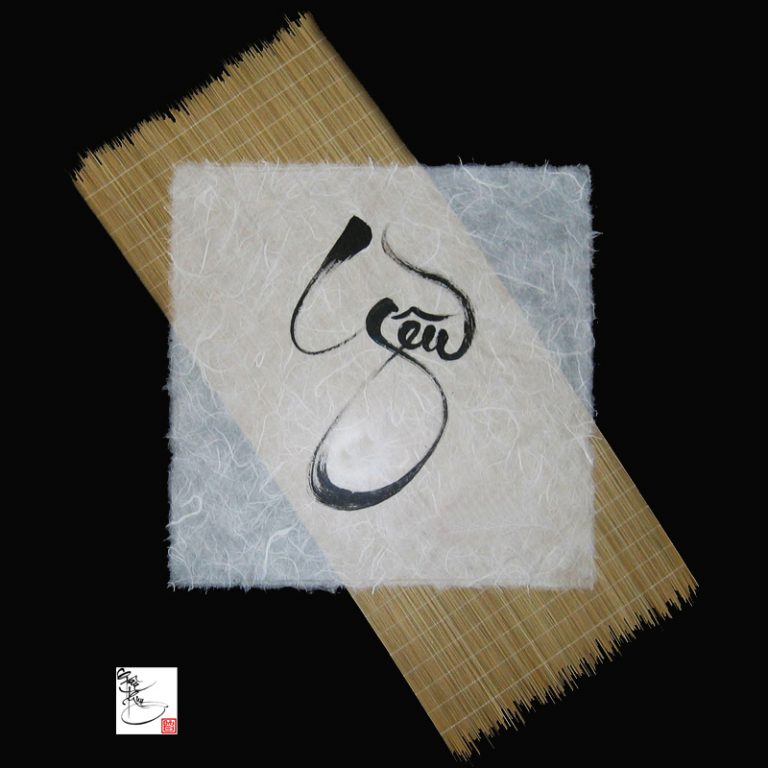
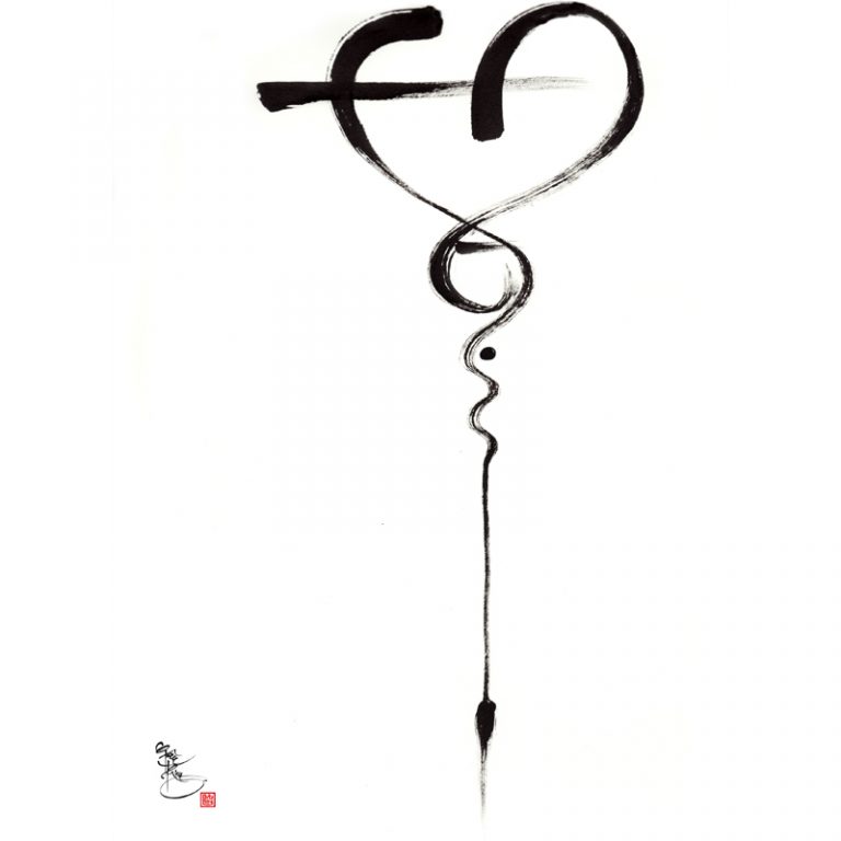
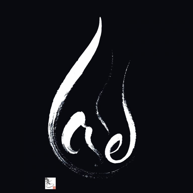
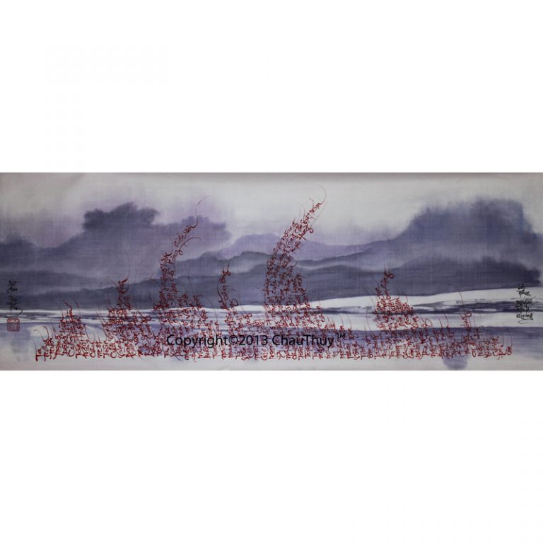
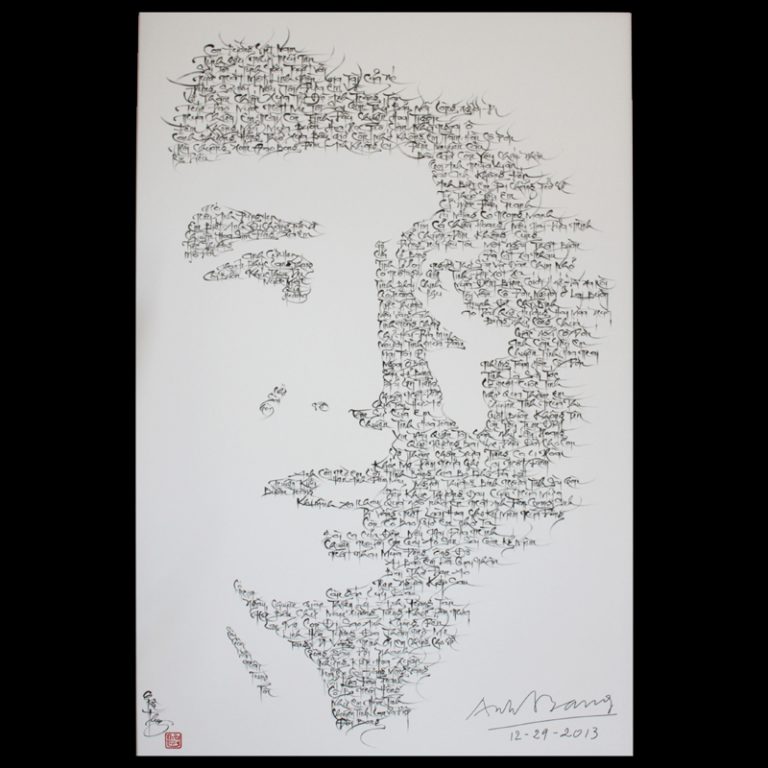
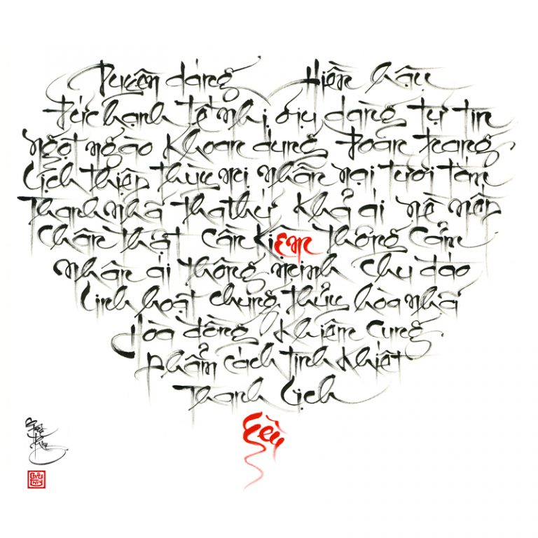
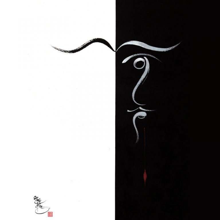
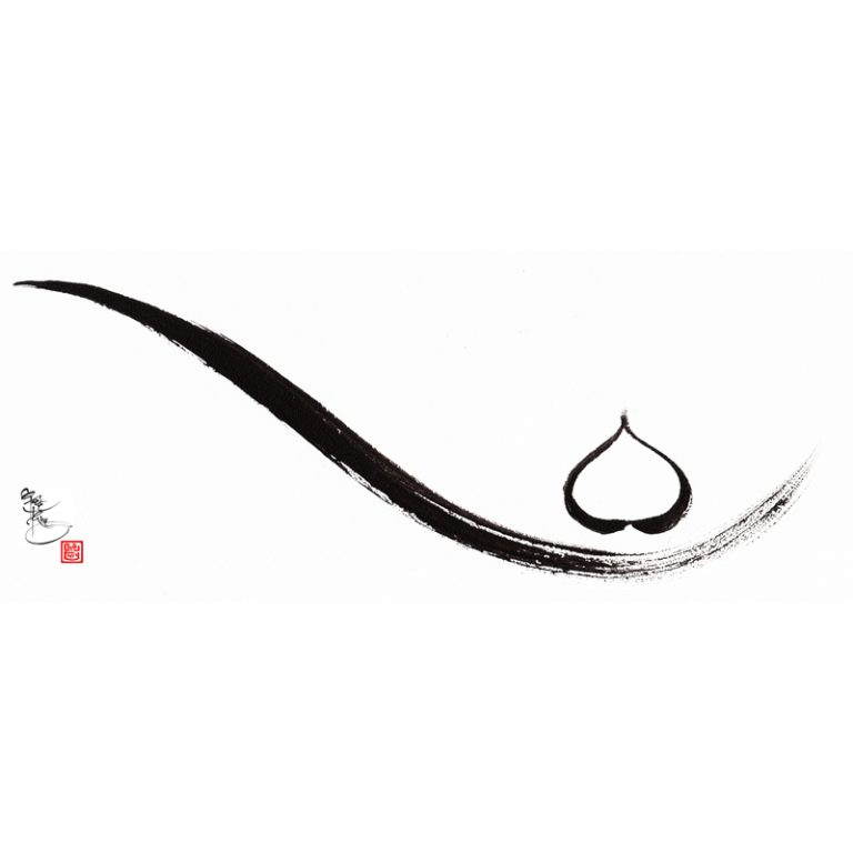
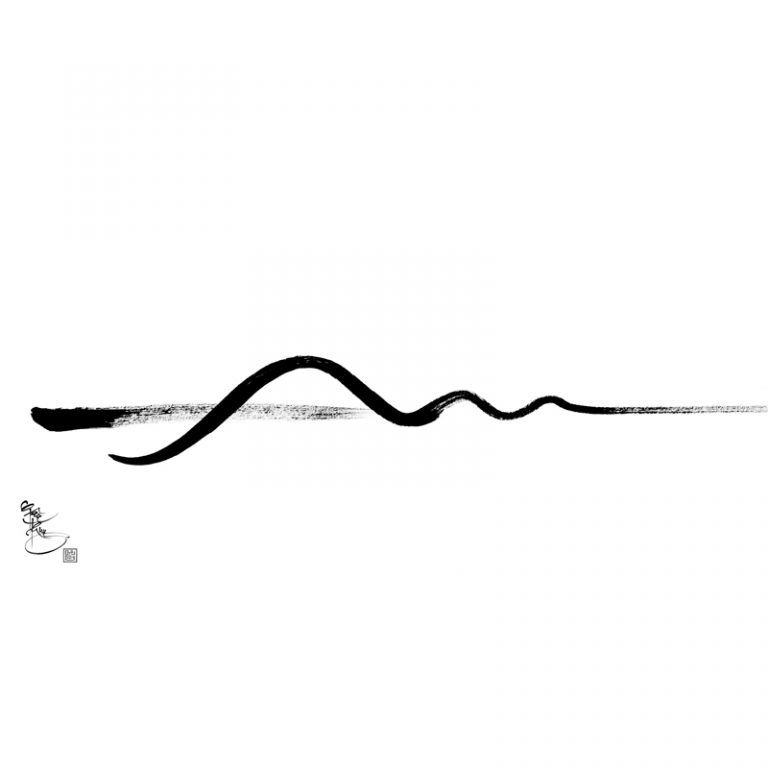
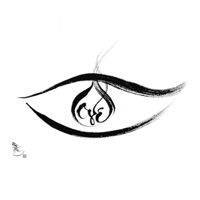
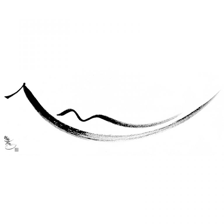
Impressionistic Calligraphy (I© See) style is generally composed of two parts: an actual form and a visual impression. The first part, the form, can be compared to fonts writing style that is unique to a calligrapher. Some fonts require thick and heavy strokes to express the strength, courage, firmness and determination while other fonts only require gentle and wavy strokes to evoke a sense of elegance, delicacy, calmness and relaxation. The second part, the visual impression, can be created by Silhouette effects contrasting black strokes on a white background or vice versa to evoke an image of a familiar object in a viewer’s mind. The visual impression can also be achieved by certain elements, which can be skillfully embedded in the forms or which can be enhanced by coloring effect. These embedded elements serve to trigger emotional responses from viewers to the feelings that the artist intends to capture at the moment of his artistic creation. When black and white colors intertwine, the “graying” effect is created. It is the “graying” effect that evokes a visual impression which varies depending upon a viewer’s unique experience, emotion and culture.

